
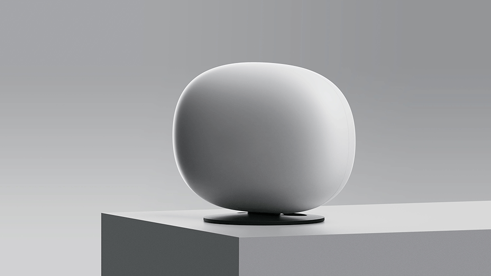


All-Fi 5G Hub
User Interaction and Animation Design for the AT&T ALL-FI 5G HUB
My role was designing the visual user experience on the digital display of the new All-Fi AT&T 5g home router. My tasks consisted of lining out the ideal path for set up, give the device’s visuals a tone and character that matched AT&T’s image, create a typeface based off their existing Alek font, and animate every pixel on the 7 x 21 dot display. all this culminated to create a unique and delightful out-of-the-box experience from the initial boot-up to day-to-day use.
The animations where hand animated in Figma using components to instantly prototype movements on the all-fi device itself.
Our work was the recipient of the 2024 iF Design Award

Brand Voice
Vibrant
Being vibrant is all about communicating with energy, passion, and confidence.
It also means that we're talking in ways that are relevant and meaningful to the people we serve.
No matter who we're communicating with, we need to connect the dots between what we're talking about and what's in it for our audience.
Curious
Being curious means that we listen to our customers' needs and imagine what their day looks like. Before introducing solutions, we ask questions about how people experience the world and interact with our products.
Human
When our communications are human, we talk in an honest, down-to-earth, and relatable way. We make it human by drawing on our natural way of speaking. That doesn't mean writing exactly like we'd talk to friends. It's more about getting away from the habit of using jargon.
For instance, have you ever been on a customer service call where you were asked to read a long tracking number to a robot? Something weird happens. We start talking like robots.
If we aren't careful, the same thing can happen when we communicate at work. We get so focused on getting our point across that we sound mechanical and unfeeling.

Modum Animation Design

Plug-in Loading screen
Signal Strength Test
Successful 5G connection!
Digital Typeface
The digital typeface for the modum was an interesting challenge because I had to interpret AT&T’s “Alek” typeface with only a 7x21 dot matrix.
On the right are the two proposed typefaces. One is more square, while the other cuts the corners to imitate the curves more accurately. even though the squared version is more typical for a digital screen, the more-rounded font passed more legibility tests from near and far away.


Device QR code - sign in - Placing All-fi Hub

Smart-positioning for in home placement.
